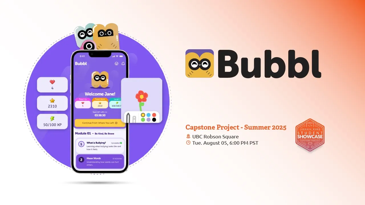
Bubbl
A gamified learning companion for teaching body safety and emotional awareness early

"/><stop offset="1" stop-color="rgba(135, 135, 135, 0)"/></linearGradient><filter filter-units="objectBoundingBox" height="164.1%" id="jGSLxkaU8-3823653796-shadow-inset" width="142.9%" x="-21.4%" y="-32.0%"><feGaussianBlur in="SourceAlpha" result="jGSLxkaU8-3823653796-shadow-inset-0-blur" stdDeviation="3"/><feOffset dx="0" dy="-3" in="jGSLxkaU8-3823653796-shadow-inset-0-blur" result="jGSLxkaU8-3823653796-shadow-inset-0-offset"/><feComposite in="jGSLxkaU8-3823653796-shadow-inset-0-offset" in2="SourceAlpha" k2="-1" k3="1" operator="arithmetic" result="jGSLxkaU8-3823653796-shadow-inset-0-composite"/><feFlood flood-color="rgba(255, 255, 255, 0.39)" result="jGSLxkaU8-3823653796-shadow-inset-0-flood"/><feComposite in="jGSLxkaU8-3823653796-shadow-inset-0-flood" in2="jGSLxkaU8-3823653796-shadow-inset-0-composite" operator="in" result="jGSLxkaU8-3823653796-shadow-inset-0"/></filter><path d="M 0 8 C 0 3.582 3.582 0 8 0 L 20 0 C 24.418 0 28 3.582 28 8 L 28 16 C 28 20.418 24.418 24 20 24 L 18.33 24 L 16.944 26.4 C 15.636 28.667 12.364 28.667 11.056 26.4 L 9.67 24 L 8 24 C 3.582 24 0 20.418 0 16 Z M 8.948 9.245 C 7.912 9.245 7.069 10.088 7.069 11.121 C 7.069 12.158 7.912 13 8.948 13 C 9.984 13 10.828 12.158 10.828 11.121 C 10.828 10.088 9.984 9.245 8.948 9.245 Z M 18.948 9.245 C 17.912 9.245 17.069 10.088 17.069 11.121 C 17.069 12.158 17.912 13 18.948 13 C 19.984 13 20.828 12.158 20.828 11.121 C 20.828 10.088 19.984 9.245 18.948 9.245 Z M 13.948 9.245 C 12.912 9.245 12.069 10.088 12.069 11.121 C 12.069 12.158 12.912 13 13.948 13 C 14.984 13 15.828 12.158 15.828 11.121 C 15.828 10.088 14.984 9.245 13.948 9.245 Z" id="jGSLxkaU8-3823653796" transform="translate(6 7)"/></defs><use fill="url(%23jGSLxkaU8-3823653796-linear-gradient)" height="28.100000000000005px" href="%23jGSLxkaU8-3823653796" id="jGSLxkaU8" width="28px"/><use filter="url(%23jGSLxkaU8-3823653796-shadow-inset)" href="%23jGSLxkaU8-3823653796"/></svg>)
Received special mention from the jury for outstanding craft and contribution to the field
"/><stop offset="1" stop-color="rgba(135, 135, 135, 0)"/></linearGradient><filter filter-units="objectBoundingBox" height="161.9%" id="uMDl8LXKQ-3028495436-shadow-inset" width="152.2%" x="-26.1%" y="-31.0%"><feGaussianBlur in="SourceAlpha" result="uMDl8LXKQ-3028495436-shadow-inset-0-blur" stdDeviation="3"/><feOffset dx="0" dy="-3" in="uMDl8LXKQ-3028495436-shadow-inset-0-blur" result="uMDl8LXKQ-3028495436-shadow-inset-0-offset"/><feComposite in="uMDl8LXKQ-3028495436-shadow-inset-0-offset" in2="SourceAlpha" k2="-1" k3="1" operator="arithmetic" result="uMDl8LXKQ-3028495436-shadow-inset-0-composite"/><feFlood flood-color="rgba(255, 255, 255, 0.39)" result="uMDl8LXKQ-3028495436-shadow-inset-0-flood"/><feComposite in="uMDl8LXKQ-3028495436-shadow-inset-0-flood" in2="uMDl8LXKQ-3028495436-shadow-inset-0-composite" operator="in" result="uMDl8LXKQ-3028495436-shadow-inset-0"/></filter><path d="M 23 18.296 C 23 20.036 22.244 21.69 20.929 22.83 L 15.429 27.596 C 13.174 29.55 9.826 29.55 7.571 27.596 L 2.071 22.83 C 0.756 21.69 0 20.036 0 18.296 L 0 6 C 0 2.686 2.686 0 6 0 L 17 0 C 20.314 0 23 2.686 23 6 Z M 9.382 10.056 C 9.236 10.352 8.954 10.556 8.629 10.603 L 5.897 11 C 5.076 11.12 4.749 12.128 5.342 12.706 L 7.319 14.633 C 7.555 14.863 7.663 15.194 7.607 15.518 L 7.14 18.239 C 7 19.056 7.858 19.679 8.591 19.293 L 11.035 18.009 C 11.326 17.855 11.674 17.855 11.965 18.009 L 14.409 19.293 C 15.142 19.679 16 19.056 15.86 18.239 L 15.393 15.518 C 15.337 15.194 15.445 14.863 15.681 14.633 L 17.658 12.706 C 18.251 12.128 17.924 11.12 17.103 11 L 14.371 10.603 C 14.046 10.556 13.764 10.352 13.618 10.056 L 12.397 7.581 C 12.03 6.838 10.97 6.838 10.603 7.581 Z" id="uMDl8LXKQ-3028495436" transform="translate(8.5 6)"/></defs><use fill="url(%23uMDl8LXKQ-3028495436-linear-gradient)" height="29.061040226295894px" href="%23uMDl8LXKQ-3028495436" id="uMDl8LXKQ" width="23px"/><use filter="url(%23uMDl8LXKQ-3028495436-shadow-inset)" href="%23uMDl8LXKQ-3028495436"/></svg>)
Won "Best of Show" award in the showcase event
Introduction: Turning a real-world problem into a mobile experience
Bubbl was developed as the final capstone project for Langara College’s Web and Mobile App Design and Development postgraduate program. Our cohort was divided into cross-functional teams and challenged to identify a real problem encountered in everyday life, then solve it through a mobile application that meaningfully leveraged native mobile capabilities such as touch, drawing, camera, motion, and haptics.
Our team consisted of six designers and four developers, working under an intense thirteen-week timeline from ideation to final presentation. To stay aligned and move fast without sacrificing quality, we adopted an agile workflow with weekly sprints, daily stand-ups, and regular retrospective sessions. This structure allowed us to continuously validate decisions, identify blockers early, and adjust scope without losing sight of the core problem.

My role: Owning the core experience while supporting design leadership at scale
As a product designer, I contributed across the full design lifecycle, from early research and problem framing to interaction design, visual systems, and handoff. I fully owned several core flows that connected the experience end to end:
Lesson Overview (child homepage)
Article Overview and Detail views (parent homepage)
Notifications
Profile management
These surfaces acted as the backbone of the product, tying together learning, progress tracking, and parental oversight.
Because I had previously taken on Lead Designer roles in multiple major projects within the program, the team decided to rotate leadership for this project and gave me the responsibility of supporting the newly appointed Lead Designer by:
Advising on UX and interaction decisions
Leading the creation and maintenance of the design system
Reviewing other designers’ work for alignment and consistency
In addition to product design, I also volunteered to create marketing and presentation materials such as this introduction video for the final showcase.
Problem framing: Addressing sensitive topics before it is too late
Our initial discussions led us toward early childhood education, specifically children between the ages of five and ten. This age group faces rapid emotional and social development, yet interacts with technology far less independently than adults, creating a complex design space with both constraints and opportunity.
Despite advances in developmental psychology and education, topics such as body safety, personal boundaries, and bullying are often introduced too late. Children at this age are forming friendships, asserting independence, interacting with authority figures and peers of different ages, and developing self-awareness, often without the language or tools to articulate uncomfortable experiences.
At the same time, parents and educators struggle to identify early warning signs or initiate conversations around these sensitive subjects. The gap between when these lessons should start and when they actually do became the core problem Bubbl set out to address.


Market analysis: Confirming the urgency and the lack of child-centered digital solutions
To validate the opportunity further, I reviewed research and educational material from Kids in the Know, the national safety education program of the Canadian Centre for Child Protection. The data supported both the urgency of the problem and the lack of engaging, age-appropriate digital tools addressing it.
Early research revealed:
One in three children experience bullying before the age of ten
Sixty percent of parents feel unprepared to talk about body safety with their children
A significant portion of emotional learning occurs before the age of eight
Children learn best through play, repetition, and story-driven interaction
Together, these insights helped solidify Bubbl’s direction and justified a play-first educational approach.

User interviews: Learning how parents regulate technology, education, and sensitive topics
To ground our assumptions, we conducted qualitative interviews with five parents. These conversations focused on parent-child dynamics, attitudes toward technology, educational approaches, and boundaries around device usage.
Key insights from these interviews included:
Children were typically allowed limited screen time and used devices belonging to their parents under supervision
Games, videos, and visual stories were strongly preferred over text-heavy educational materials
Three out of five parents had never discussed the sensitive topics Bubbl focuses on with their children
All parents were open to introducing such an app, provided the educational content came from trusted and reputable sources
These findings reinforced the importance of credibility, parental control, and age-appropriate engagement.

Information architecture: Translating research, constraints, and native capabilities into structure
With insights and constraints clearly defined, we began shaping the product roadmap. As a capstone requirement, the application needed to meaningfully incorporate native mobile features, which influenced both interaction design and feature prioritization.
The experience was structured around several core components:
Gamified learning mechanics tied directly to educational progress
A centralized Learning Hub where lessons could be revisited and tracked
Emotion-expression tools powered by touch-based drawing
A parental monitoring and authorization system secured through passwords and Face ID
I translated these requirements into flow diagrams, defining the overall information architecture and owning the full parent flow to ensure oversight and control were treated as first-class experiences.


Concept exploration: Mapping the experience at low-fidelity
With the foundational flows in place, I moved into concept exploration for the screens under my ownership. These included both child and parent homepages, profile management, and notification surfaces.
Because these screens sat at the center of the experience, connecting lessons, progress, rewards, and monitoring, I focused on clarity of navigation and ease of movement across the app. Low-fidelity wireframes were used to validate layout structure, interaction patterns, and access points before visual styling was introduced.


UI setup: Building a system that scales across designers
One of my primary responsibilities was creating and maintaining the design system. I defined the core color palette, typography, and interaction principles, and custom-built all shared components used throughout the app.
To ensure consistency across a large design team, I created clear rulesets, layout templates, and Figma Libraries, and helped each designer set up their workspace correctly. As the project matured, I also structured the design documentation and streamlined handoff processes to support efficient development.


Personal contribution: Separating child and parent experiences
Given that children rarely use devices without supervision, I proposed a dual-profile system with clearly separated modes. One mode was designed exclusively for children, focusing on learning, play, and expression. The other was built for parents and guardians, giving them administrative control, visibility into progress, and access to educational content intended for adults.
I designed and owned the full parent experience, positioning parents as administrators within an authorization-based system. They could manage multiple child profiles, track learning pace, identify areas of difficulty, and observe potential behavioral signals. To protect sensitive information, access to parent profiles was gated behind Face ID or a secure password.
Personal contribution: Using a mascot to build emotional investment
Children disengage quickly if an experience feels static or instructional. To counter this, I drew inspiration from Tamagotchi and similar digital pet experiences, where emotional attachment and responsibility drive engagement.
I proposed a system in which a mascot accompanies the child throughout their learning journey. Starting a lesson would cost one health point from the mascot, introducing light tension and choice. As children progressed, both they and the mascot would level up together. Rewards earned through learning could be used to customize and nurture the mascot, deepening emotional investment and reinforcing continued use.

Personal contribution: Structuring learning as quests
To support long-term engagement and a clear sense of progress, I designed a quest-based module system. Lessons were grouped into themed modules focused on specific topics such as body safety, bullying, or personal hygiene.
Each module followed a structured sequence of interactive lessons, with rewards granted upon completion. Individual lessons used an interactive quiz format inspired by language-learning platforms, reinforcing learning through repetition, feedback, and visible progress. Together, the module system and mascot mechanics formed a cohesive loop that balanced education and play.


Tech stack: Supporting a multi-layered product with the right tools
Given the product’s engagement layers and complexity, the project relied on a broad set of tools to support collaboration, design, and production:
Jira for task tracking and sprint management
Slack for team communication
Figma for wireframing, prototyping, and presentations
Photoshop and Illustrator for visual assets
After Effects for mascot animations and motion assets
Premiere Pro for video production
InDesign for print and presentation materials

Results: Recognition without a public launch
Although Bubbl was a concept product and never launched publicly, it was presented with a live demo at Langara College’s largest annual product showcase. The event attracted a wide range of tech professionals from across the Greater Vancouver Area.
Our project received the Best in Show award, along with multiple special mentions from the judging panel for design quality and depth of user experience. The recognition validated both the problem we chose to tackle and the care taken in crafting an experience for a highly sensitive audience.
Watch the Event