
Morpara
Designing a regulation-resilient fintech platform for international money transfers in a hyperinflation economy

"/><stop offset="1" stop-color="rgba(135, 135, 135, 0)"/></linearGradient><filter filter-units="objectBoundingBox" height="146.7%" id="FA5JTt_2g-2980508724-shadow-inset" width="128.6%" x="-14.3%" y="-23.3%"><feGaussianBlur in="SourceAlpha" result="FA5JTt_2g-2980508724-shadow-inset-0-blur" stdDeviation="2"/><feOffset dx="0" dy="-3" in="FA5JTt_2g-2980508724-shadow-inset-0-blur" result="FA5JTt_2g-2980508724-shadow-inset-0-offset"/><feComposite in="FA5JTt_2g-2980508724-shadow-inset-0-offset" in2="SourceAlpha" k2="-1" k3="1" operator="arithmetic" result="FA5JTt_2g-2980508724-shadow-inset-0-composite"/><feFlood flood-color="rgba(255, 255, 255, 0.39)" result="FA5JTt_2g-2980508724-shadow-inset-0-flood"/><feComposite in="FA5JTt_2g-2980508724-shadow-inset-0-flood" in2="FA5JTt_2g-2980508724-shadow-inset-0-composite" operator="in" result="FA5JTt_2g-2980508724-shadow-inset-0"/></filter><path d="M 13.997 6.323 C 16.02 6.323 17.781 6.437 19.351 6.644 C 18.915 4.143 16.695 2.229 14.012 2.229 L 13.986 2.229 C 12.541 2.229 11.184 2.774 10.16 3.765 C 9.343 4.556 8.829 5.559 8.642 6.644 C 10.212 6.437 11.975 6.323 13.997 6.323 Z M 27.993 18.353 C 27.993 27.439 26.638 30 13.997 30 C 1.786 30 0 26.854 0 18.353 C 0 14.59 0.249 11.326 1.786 9.366 C 2.911 7.93 3.757 7.684 6.318 7.07 C 6.441 5.207 7.203 3.491 8.554 2.183 C 10.008 0.774 11.935 0 13.981 0 L 14.016 0 C 18.102 0 21.426 3.135 21.677 7.07 C 24.236 7.685 25.512 7.932 26.638 9.366 C 28.174 11.326 27.993 14.227 27.993 18.353 Z M 8.948 12.245 C 7.912 12.245 7.069 13.088 7.069 14.121 C 7.069 15.158 7.912 16 8.948 16 C 9.984 16 10.828 15.158 10.828 14.121 C 10.828 13.088 9.984 12.245 8.948 12.245 Z M 18.948 12.245 C 17.912 12.245 17.069 13.088 17.069 14.121 C 17.069 15.158 17.912 16 18.948 16 C 19.984 16 20.828 15.158 20.828 14.121 C 20.828 13.088 19.984 12.245 18.948 12.245 Z" id="FA5JTt_2g-2980508724" transform="translate(6 5)"/></defs><use fill="url(%23FA5JTt_2g-2980508724-linear-gradient)" height="30px" href="%23FA5JTt_2g-2980508724" id="FA5JTt_2g" width="28px"/><use filter="url(%23FA5JTt_2g-2980508724-shadow-inset)" href="%23FA5JTt_2g-2980508724"/></svg>)
Over 300,000 downloads
on IOS & Android devices
"/><stop offset="1" stop-color="rgba(135, 135, 135, 0)"/></linearGradient><filter filter-units="objectBoundingBox" height="166.7%" id="OPK1fIAUt-66703118-shadow-inset" width="138.7%" x="-19.4%" y="-33.3%"><feGaussianBlur in="SourceAlpha" result="OPK1fIAUt-66703118-shadow-inset-0-blur" stdDeviation="3"/><feOffset dx="0" dy="-3" in="OPK1fIAUt-66703118-shadow-inset-0-blur" result="OPK1fIAUt-66703118-shadow-inset-0-offset"/><feComposite in="OPK1fIAUt-66703118-shadow-inset-0-offset" in2="SourceAlpha" k2="-1" k3="1" operator="arithmetic" result="OPK1fIAUt-66703118-shadow-inset-0-composite"/><feFlood flood-color="rgba(255, 255, 255, 0.39)" result="OPK1fIAUt-66703118-shadow-inset-0-flood"/><feComposite in="OPK1fIAUt-66703118-shadow-inset-0-flood" in2="OPK1fIAUt-66703118-shadow-inset-0-composite" operator="in" result="OPK1fIAUt-66703118-shadow-inset-0"/></filter><path d="M 30.883 7.831 C 30.422 4.864 28.647 2.386 26.012 1.035 C 23.437 -0.288 20.446 -0.306 17.813 0.983 C 16.961 1.399 16.186 1.929 15.502 2.562 C 14.532 1.666 13.378 0.975 12.128 0.542 C 9.465 -0.391 6.722 -0.112 4.409 1.325 C 1.997 2.826 0.37 5.464 0.055 8.39 C -0.661 15.537 5.716 20.347 10.839 24.21 C 11.799 24.933 12.727 25.632 13.569 26.315 C 14.115 26.765 14.811 27 15.502 27 C 15.879 27 16.255 26.931 16.604 26.787 C 17.044 26.623 17.374 26.354 17.751 26.045 C 18.526 25.417 19.365 24.777 20.233 24.115 C 25.455 20.13 31.956 15.17 30.883 7.831 Z" id="OPK1fIAUt-66703118" transform="translate(5 8)"/></defs><use fill="url(%23OPK1fIAUt-66703118-linear-gradient)" height="27px" href="%23OPK1fIAUt-66703118" id="OPK1fIAUt" width="31px"/><use filter="url(%23OPK1fIAUt-66703118-shadow-inset)" href="%23OPK1fIAUt-66703118"/></svg>)
3.9/5 App Store Rating
among users
Introduction: Translating a fintech vision into a scalable and compliant product experience
Morpara entered the market with a clear business vision and defined performance metrics. After exploring multiple design partners, the company selected Agency Look following rounds of briefings and strategic presentations where we demonstrated how we would translate their vision into a tangible, scalable product.
At the time the project was greenlit, I was already working on multiple end-to-end projects. Despite a full schedule, I volunteered to take ownership of Morpara because of its complexity. Designing for a heavily regulated financial environment while aligning with strict performance metrics presented a challenge that demanded strategic thinking beyond interface design.
My role: Sole product designer owning strategy, UX architecture, and system design
I was assigned as the primary product designer responsible for the full product lifecycle, including:
Product research and competitive analysis
UX and product strategy definition
Information architecture and flow design
Low-fidelity concept exploration
Design system creation and maintenance
High-fidelity prototyping and iteration cycles
Moderating stakeholder demos and critique sessions
Developer documentation and structured handoff
Throughout the project, I translated business requirements and regulatory constraints into structured user flows and scalable product logic. In several key areas, I proposed alternative solutions that challenged the predefined strategy. After presenting structured arguments and prototypes to stakeholders, multiple proposals were adopted into the final product, elevating the experience beyond the original vision.

Problem framing: Designing for international transfers under constant regulatory volatility
Turkey’s economic instability and hyperinflation introduced major disruptions to international financial transactions. Government regulations around foreign currency accounts, transfer limits, and authorized fintech services were frequently updated. Several global platforms were restricted or banned, leaving individuals and businesses without reliable international transfer options.
The environment presented multiple challenges:
Rapidly changing compliance requirements
Restrictions on non-bank fintech institutions
Foreign currency holding limits
Increased documentation requirements
User confusion around policy changes
Morpara aimed to create a frictionless alternative in a system increasingly designed to introduce friction. The product needed to remain flexible, compliant, and transparent while shielding users from regulatory complexity.


Competitive analysis: Reverse-engineering fintech leaders without a research budget
The client did not allocate budget for user interviews or usability testing. To compensate, I conducted an extensive competitive analysis of local and global fintech platforms operating in similar domains.
Products analyzed included:
Wise
PayPal
Tinkoff
Papara
FUPS
The analysis focused on:
Information hierarchy and navigation models
Transaction transparency patterns
Risk communication strategies
Feature prioritization
Conversion optimization within onboarding flows

From these insights, I generated structured user stories to guide product decisions.
Example User Stories:
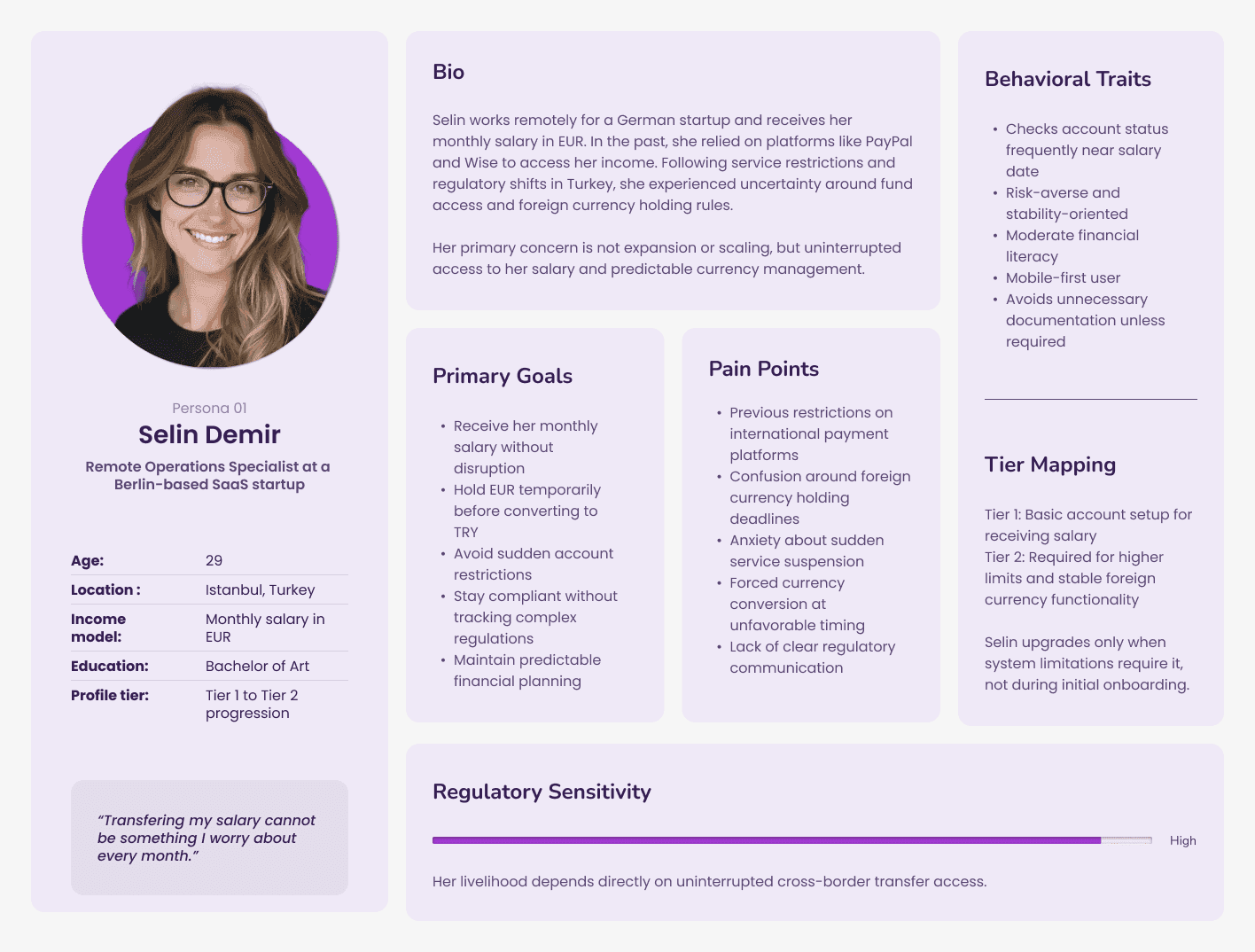
As a resident in Turkey facing unstable international transfer access, I want a reliable and regulation-compliant platform so I can send and receive money abroad without sudden service disruptions.
As a traveler, I want to use one app and one card across currencies so I don’t need separate bank accounts in each country.
As a parent with a child studying abroad, I want clear, step-by-step instructions to send money confidently without assistance.
As an independent business owner, I want secure international transfers so my funds remain protected during unexpected disruptions.
As a business owner, I want flexible foreign payment options to expand my international customer base.

Regulatory deep dive: Aligning product strategy with legal and governmental constraints
Beyond competitive analysis, I conducted independent research into financial regulations affecting foreign currency accounts and international transfers. To ensure compliance and reduce future risk, I scheduled meetings with Morpara’s legal and project management teams to clarify:
Current regulatory boundaries
Areas likely to change
Legal limitations for fintech institutions
Risk exposure scenarios
Contingency planning strategies
This collaboration allowed me to design flows that were not only compliant at launch but adaptable to future regulatory shifts.
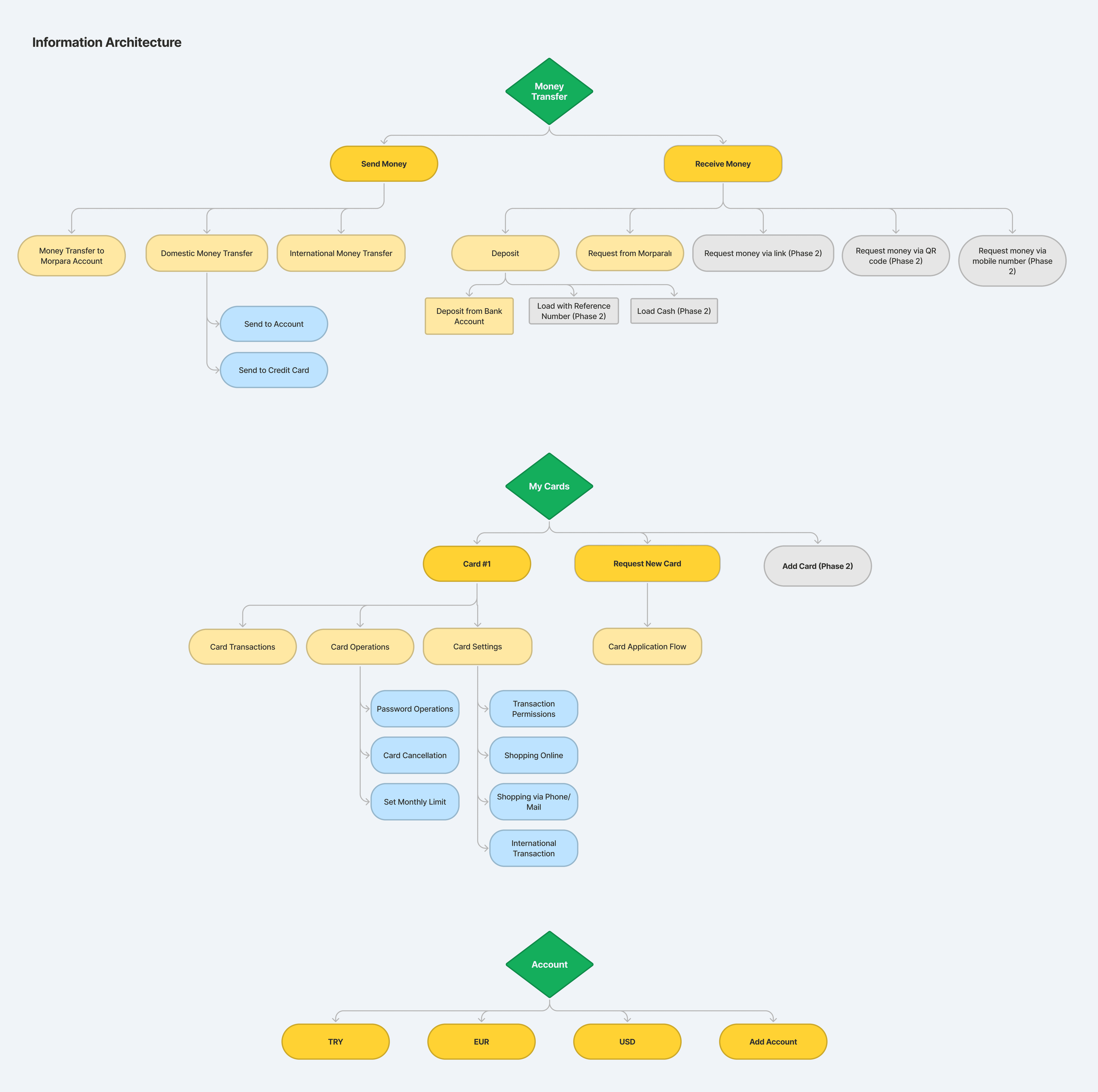
Information architecture: Building transparency, error prevention, and adaptability into the core
Based on research and constraints, I defined core strategic principles that shaped the product architecture:
Radical transparency in all transaction states
Dedicated space for regulatory updates, guides, and announcements
Clear, jargon-free microcopy for users with varying financial literacy
Immediate access to all money transfer actions
Fragmentation of complex processes into smaller, manageable steps
Flexible automation logic to support regulatory adaptation
Friction layers in high-risk areas for error prevention
Support for multiple transaction modes, including card usage and online payments
Once these principles were defined, I constructed the full flow architecture and information hierarchy before moving into conceptual design.

Concept exploration: Validating structure before visual commitment
With flows established, I created low-fidelity wireframes to visualize page structure, functionality, and interaction patterns. These wireframes were presented to Morpara stakeholders for validation and critique.
After incorporating structured feedback, I refined and finalized the interaction model before transitioning to high-fidelity designs.


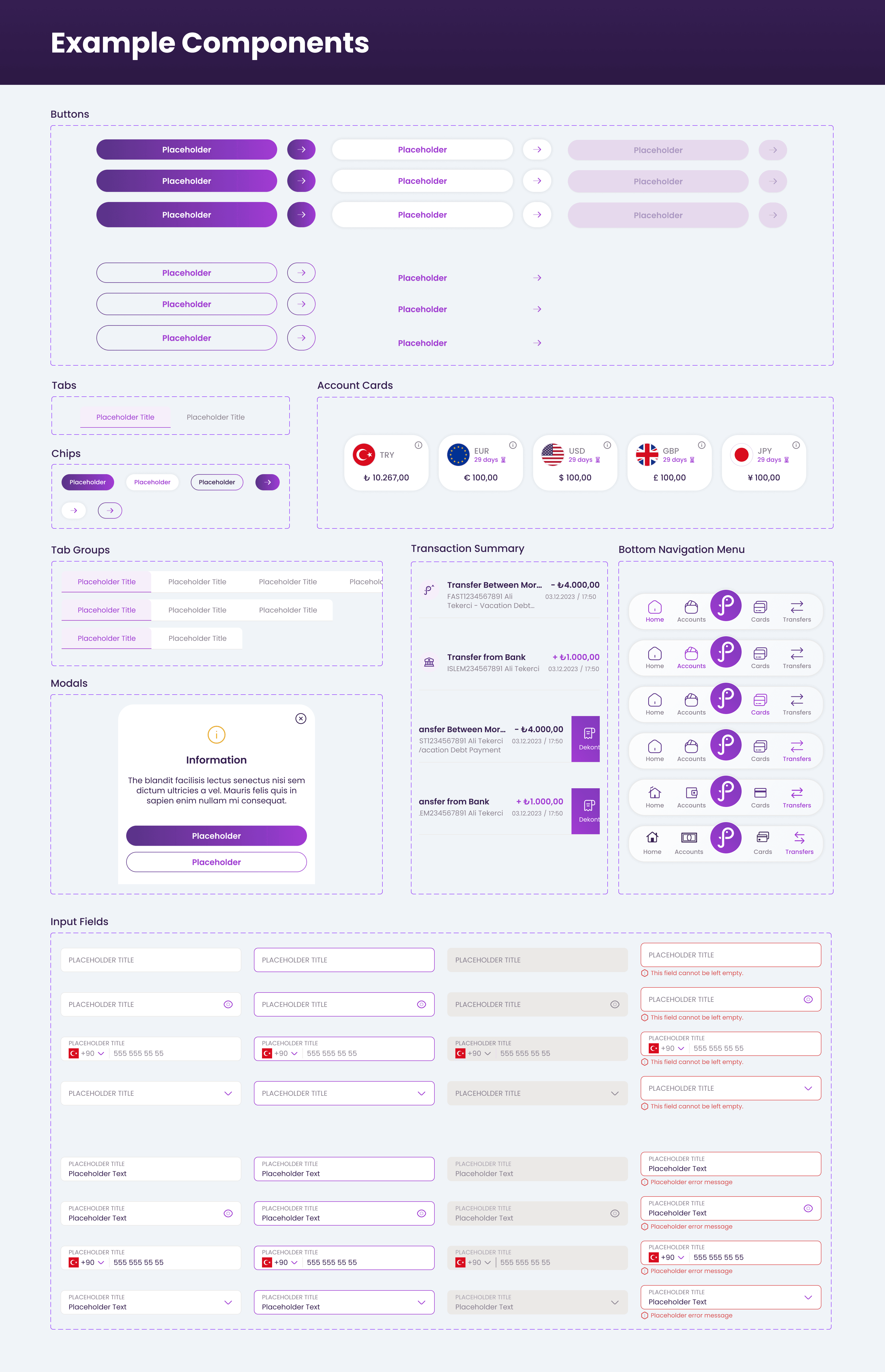
Design system: Building a scalable foundation for Morpara’s expanding ecosystem
Morpara required a custom-built design system that could support long-term scaling and future product releases.
Key considerations included:
Alignment with existing brand identity
Component-based architecture using advanced property structures
Consistency across iOS and Android despite unavailable official UI kits at the time
Documentation enabling developer independence after agency handoff
I collaborated closely with external developers to clarify native component behavior and ensure implementation accuracy. The final system served not only the launch product but also future releases and ecosystem expansion.


Personal contribution: Creating a global money transfer super menu
Money transfers were the product’s most critical feature. The initial proposal placed transfer options on the homepage above the fold. However, this conflicted with three essential homepage elements:
Account balance overview
Informational stories and updates
Transaction history list
Adding another section risked diminishing visibility of core financial information.
I proposed detaching money transfers from the homepage and introducing a dedicated bottom navigation entry that opened a global overlay containing all transfer options.
This solution:
Enabled single-tap access from any primary screen
Reduced scroll-based friction
Simplified future feature expansion
Decreased long-term architectural complexity
Although it introduced additional development effort during the alpha stage, the measurable usability and scalability benefits convinced stakeholders to adopt the change.
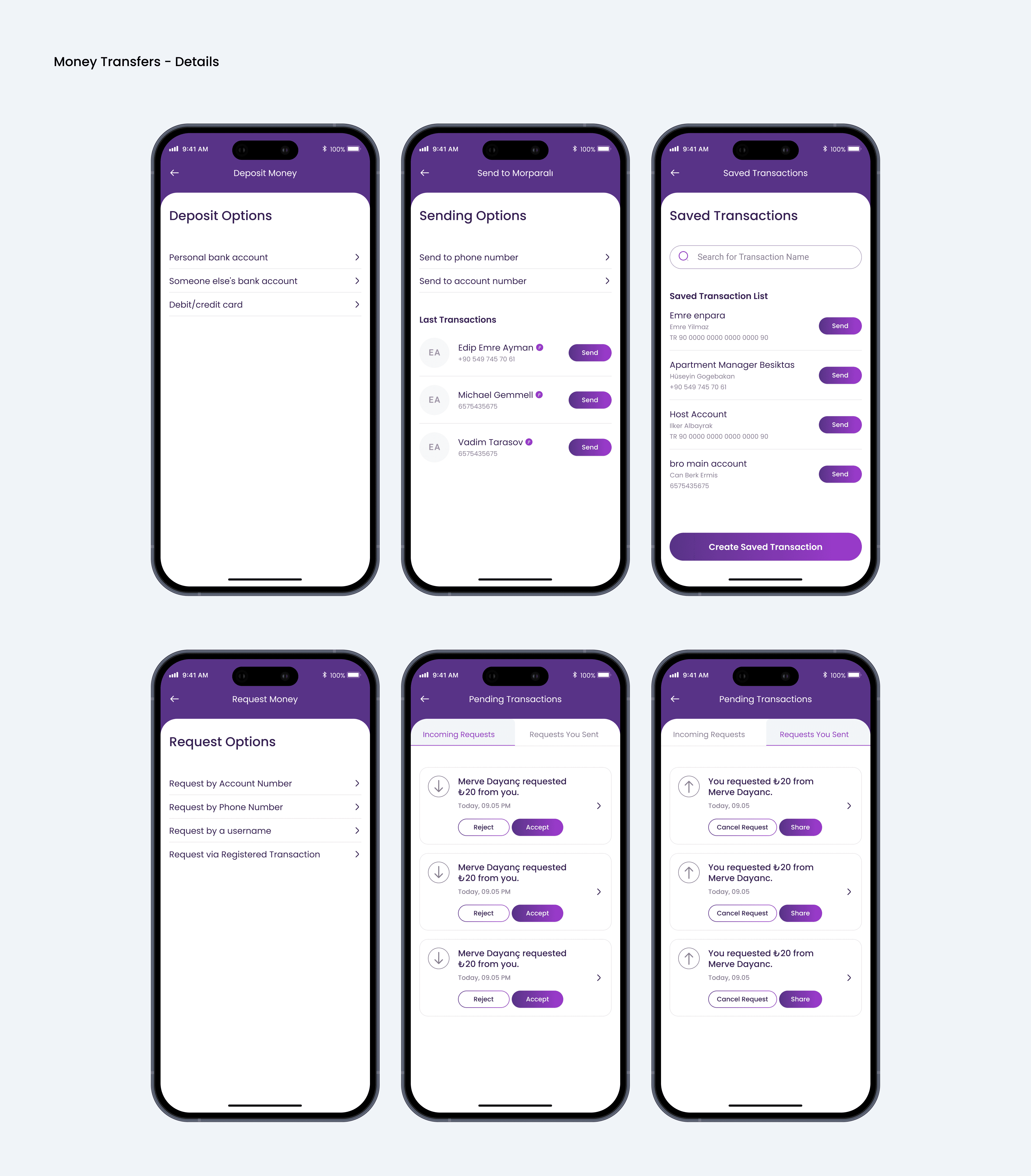
Personal contribution: Automating regulatory compliance for foreign currency accounts
Frequent regulation changes required users to convert foreign currencies within specific timeframes. Expecting users to track these policies manually created financial risk and user frustration.
I designed a time-based automation system that:
Automatically converted foreign currency holdings after the legally defined period
Sent scheduled in-app and email notifications
Increased notification frequency as deadlines approached
Allowed manual intervention before automated conversion
This approach balanced compliance, transparency, and user protection while minimizing future redevelopment costs caused by regulatory updates.

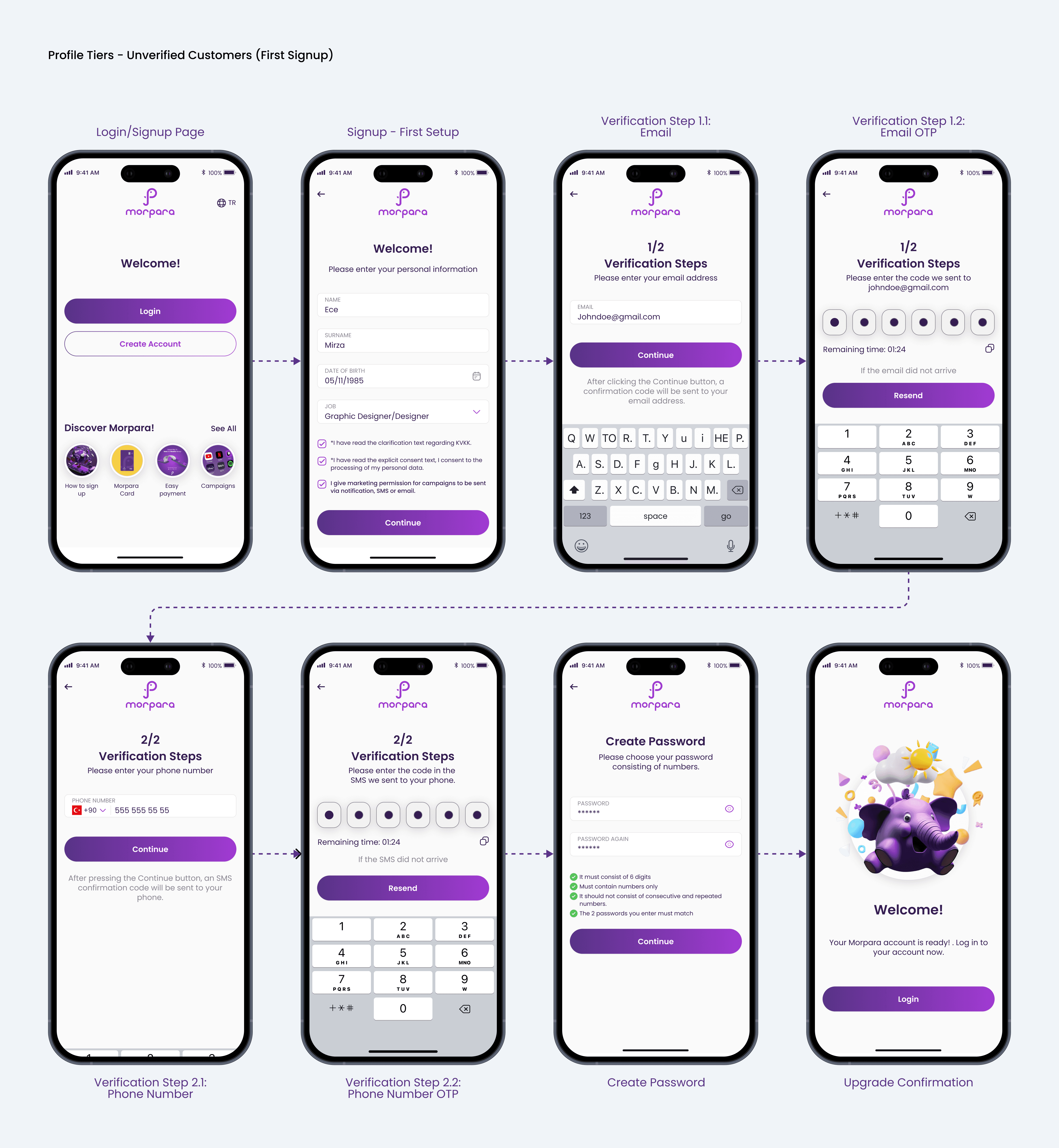
Personal contribution: Introducing tiered verification to reduce onboarding friction
Regulations required different documentation levels depending on transaction type. A single onboarding path would have introduced unnecessary friction for users performing only basic transactions.
I introduced a three-tier profile system:
Unverified customers
Verified customers
Contracted corporate customers
Users began at the lowest tier and upgraded only when required.
This structure:
Reduced initial onboarding time from days to approximately 10 minutes
Increased conversion rates by minimizing early friction
Structured complex compliance processes into progressive stages


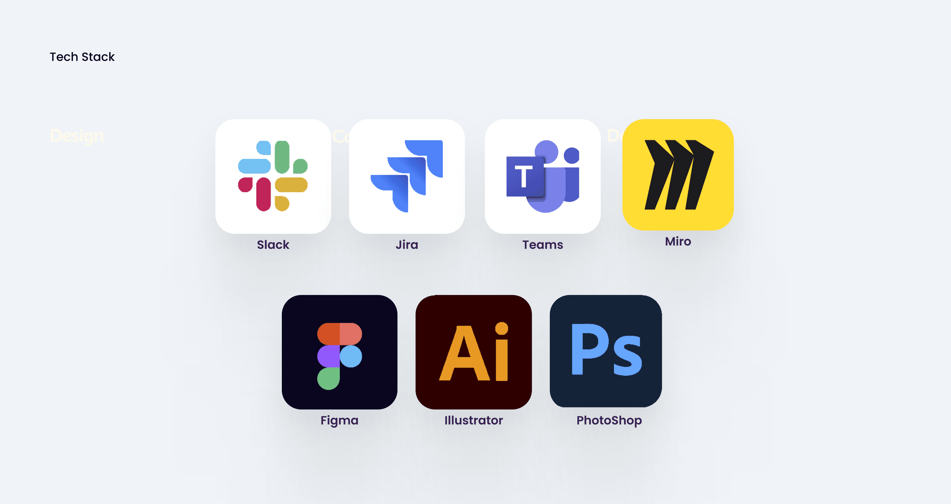
Tech stack: Supporting strategy, collaboration, and production
To execute the project efficiently, the following tools were used:
Slack for internal communication
Jira for sprint and task management
Microsoft Teams for stakeholder presentations
Miro for flow diagrams, sitemaps, and ideation
Figma for wireframing, prototyping, and system design
Photoshop and Illustrator for asset creation
Results: Scaling adoption while reducing compliance friction
Since launch, Morpara has achieved:
300,000+ downloads
A 3.9/5 App Store rating in a highly regulated domain
Additional long-term impact included:
Automation logic reducing repeated development cycles caused by regulatory shifts
A scalable design system accelerating new feature releases
Reduced onboarding friction and improved conversion
Morpara demonstrates how thoughtful product architecture, regulatory awareness, and strategic UX decisions can transform complexity into a structured and scalable financial experience.