Automotive
Internal Platform
Web App

ROLE
Primary Product Designer
TEAM
TIME & DURATION
5 Months · 2025
Company / Product Background
Tofaş is one of the most established players in Turkey’s automotive industry, with a long and influential history in vehicle production and operations. While widely recognized for its iconic, sometimes nostalgic vehicles, Tofaş’s core focus lies in managing the production and operational processes for major brands including Ford Otosan, Chrysler, Fiat, Jeep, Alfa Romeo, Ferrari, and Maserati, as well as operating its own used car brand, Otoeksper.
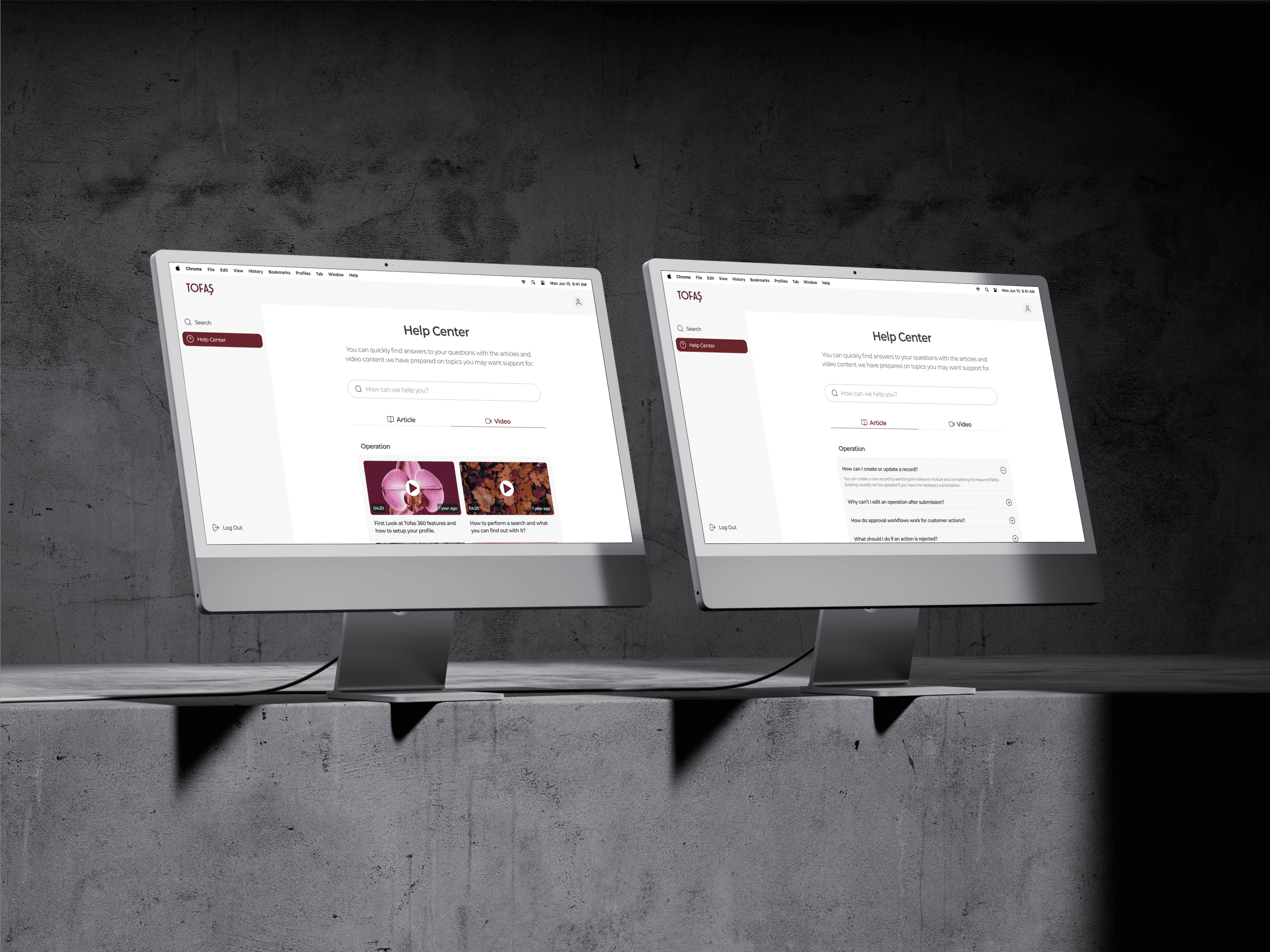
Tofaş 360 is an internal platform designed to streamline workflows for employees across service centers and automotive operations. It serves as a comprehensive data hub, allowing staff to search for vehicles and customers using advanced criteria, and instantly access complete histories, important notes, and service checkpoints. The platform also includes a built-in Help Center with both video and written guides, enabling employees to quickly resolve questions and focus on operational efficiency.
This project modernized an outdated and visually obsolete system with a complex information architecture that no longer met employee needs. By consolidating scattered workflows, Tofaş 360 reduced the time employees spent searching across multiple sources, organized service records, and lowered cognitive load. For customers, it ensured their notes, special requests, and even personal details like birthdays were seamlessly available across all service centers, eliminating repeated explanations and reducing errors.
Challenge / Context
The core challenge driving this project was that Tofaş’s legacy system was no longer equipped to handle the growing complexity and scale of operational data. Over time, the platform’s aging infrastructure and outdated interface failed to meet the evolving needs of service center employees both in terms of usability and technical architecture.
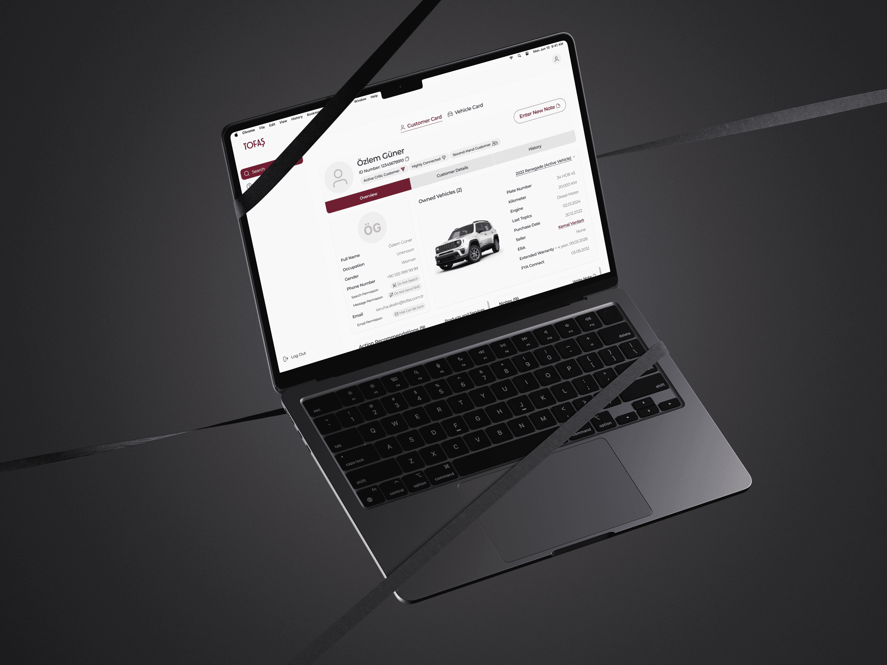
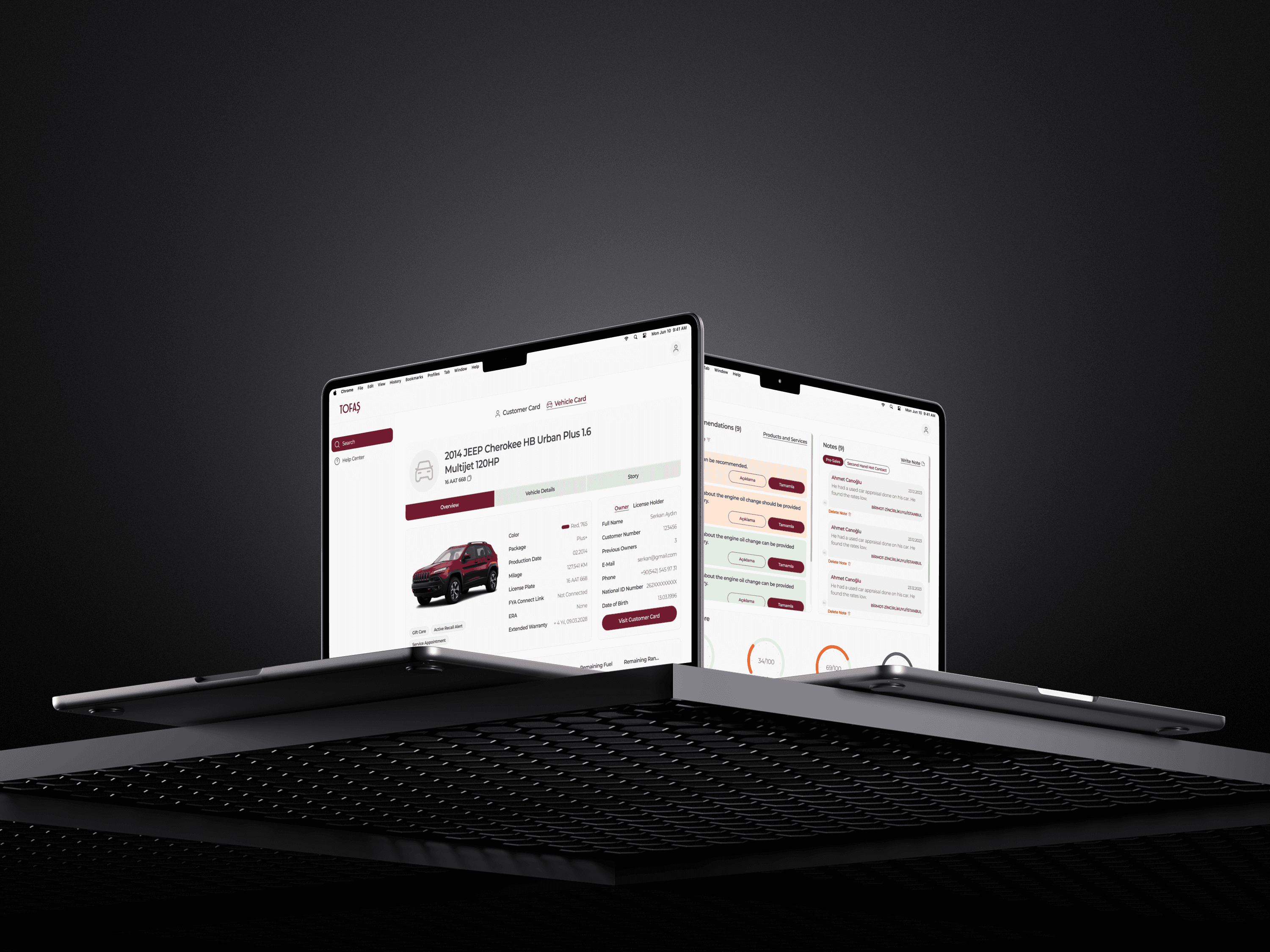
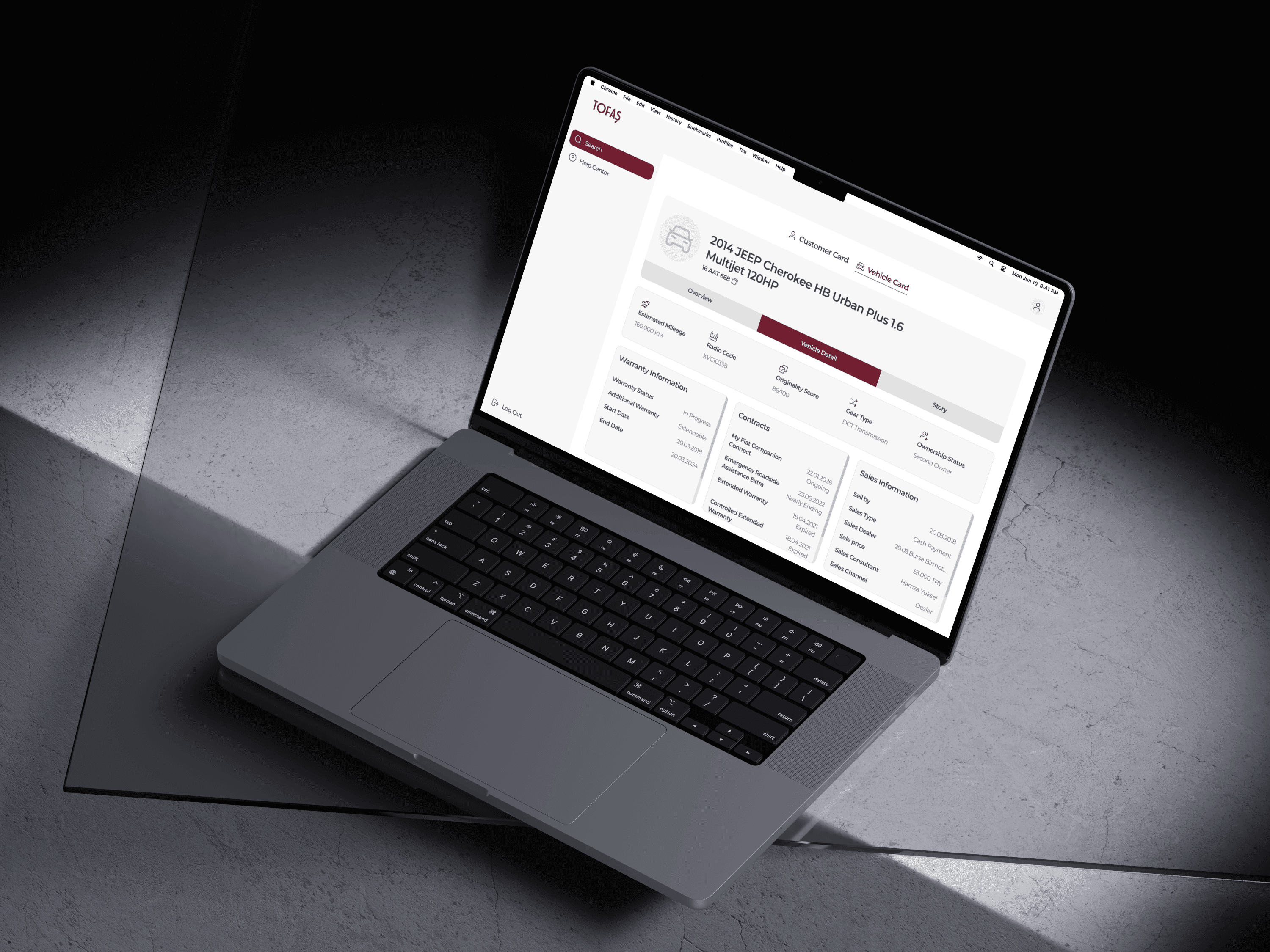
A major issue stemmed from the lack of a clear distinction between two critical data layers: vehicle information and customer information. In the existing system, these were treated almost interchangeably, despite the fact that one customer could own multiple vehicles, and any single vehicle could have multiple owners over time. This fundamental oversight in data modeling created friction in workflows and often led to confusion during search, service history reviews, and task execution.
The platform’s primary users were Tofaş service and automotive operations employees, individuals in constant contact with customers via face-to-face interaction, phone, or email. Their daily responsibilities required fast, frictionless access to both technical and personal customer data, as well as detailed vehicle histories.
From a strategic standpoint, the project aimed to boost operational efficiency, modernize a legacy tool, and deliver a significantly improved user experience for internal teams.
Solution
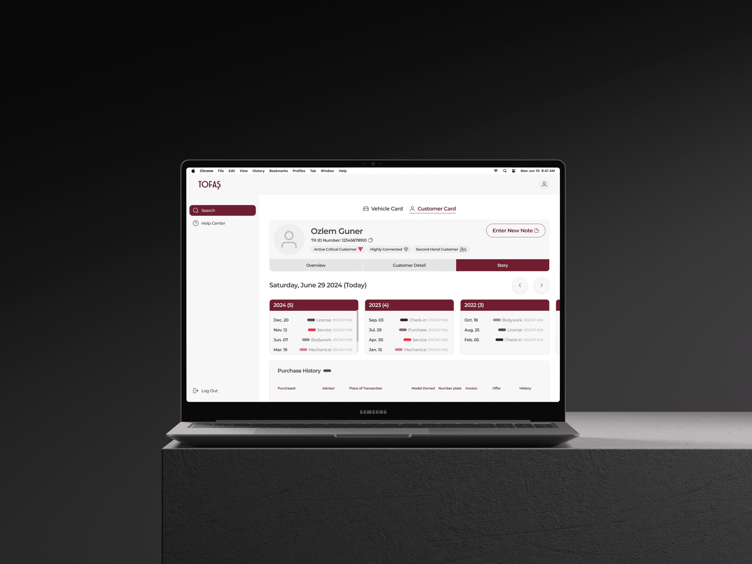
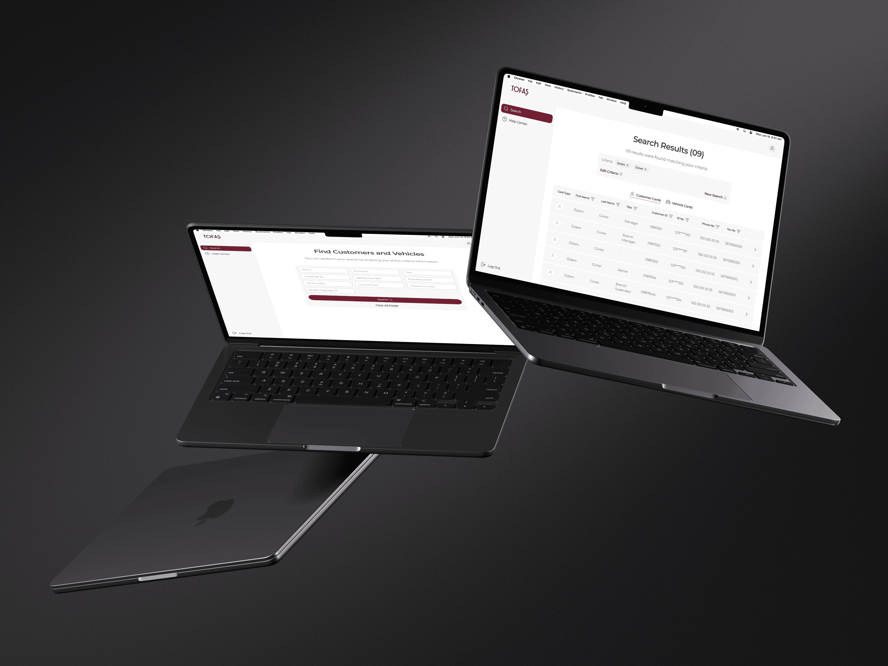
Our solution began by clearly separating vehicles and customers within the system using a dual-tab structure, establishing a foundational distinction that had been previously overlooked. In the redesigned search interface, we enabled users to combine both vehicle and customer parameters intuitively, allowing for faster and more accurate results that accounted for the dynamic relationships between vehicles and owners.
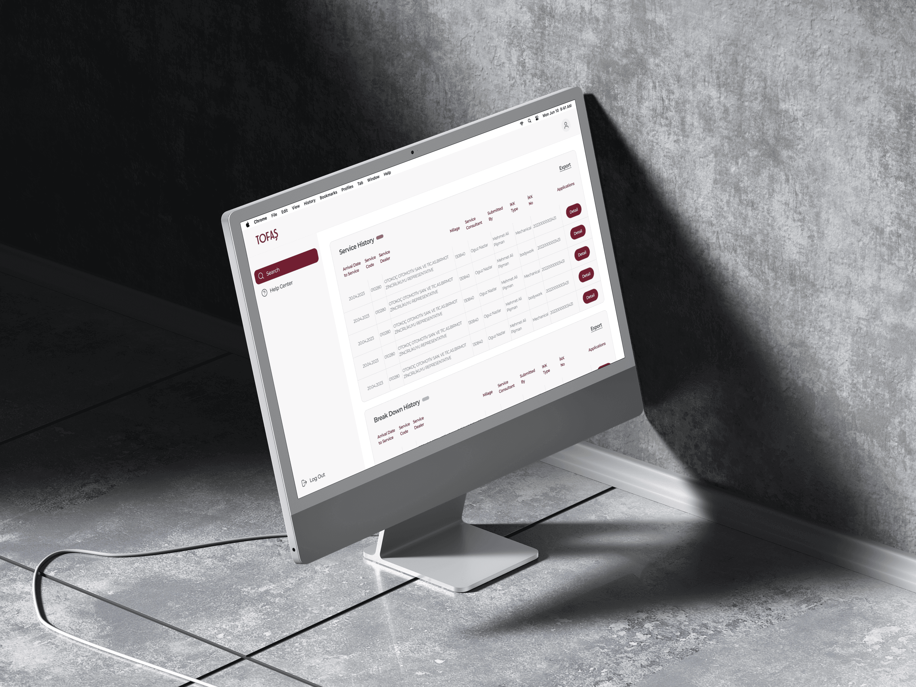
We introduced dropdown components within each detail card: vehicle cards now show previous owners, while customer cards list all vehicles associated with that user. As the variety and volume of data increased over the years, we strategically grouped related information and designed purpose-built card layouts to present content in a clean, scannable, and well-structured manner.
Given the complexity and text-heavy nature of the interface, two design principles guided our decisions throughout: visual clarity and learnability. The result was a dramatically more organized and user-friendly system that aligned with the mental models and daily workflows of service employees.

Impact & Results
Following the redesign, the response from internal users was overwhelmingly positive. Employees reported that the new structure made it significantly easier to locate the information they needed without the need to navigate across multiple disconnected systems.
The platform’s improved search logic and well-structured content architecture allowed service personnel to retrieve customer and vehicle data quickly and with confidence. By enabling them to note individual preferences, past verbal agreements, and contextual details, the platform helped elevate the quality of service delivered to customers, making each interaction more informed and personal.


