

Project Overview
Project
HesApp is an app that helps users keep track of their financial records by viewing each past, present, and future transactions and cards in the same platform and calculating your net balance after those transactions.
It helps users save money for certain occasions by automating and gamifying the process. On top of that, it enables multiple users to save money for collective activities they plan and see their progress towards the aimed amount. In addition, it helps users to bet on topics they like and uses gamification and social interactions as an exciting feature to improve the user experience opposed to typical finance apps’ regular interactions.
For unplanned, extra expenses, it creates a simulation where the system explains how this extra spending will affect the users’ balance in the future.
Background
As the result of a collaboration program between Garanti BBVA Technology and Galatasaray University, A group of students who form the most promising mobile application idea that solves financial problems end-users face daily was selected to participate in a long term UX design trainee program. Due to Covid-19 becoming a pandemic, we had to continue the program online after the first week.
During the program, we learned about the entire mobile app design process, UX design fundamentals, prototyping and design tools and project development process. At the end, with the supervision of the UX designers and our professors, we turned our app idea into a fully functioning high fidelity prototype.
My Role
As a group of 3, we all shared duties during our program. We all worked on every aspect together, however each of us were mainly responsible for different part of the process.
My roles were: Interaction designer, visual designer
My Responsibilities
Interaction design, information architecture, user journey, sitemap, visual design, prototype, ideation.
Methodology
Due to Covid-19 and the inability to physically reach university campus or any other public place, we had to skip the user research and usability studies steps. Instead, we continued with online design critique sessions with our mentors that took place every week for feedback.
Other than that, we followed Design Thinking Process and constantly iterated on our designs.
Empathizing and Ideation
At the beginning of the project, we identified our target groups to be college students, new graduates who are at the beginning of their career since these target groups seemed to struggle the most when it comes to managing their finances due to multiple amounts of unstable incomes and expenses.
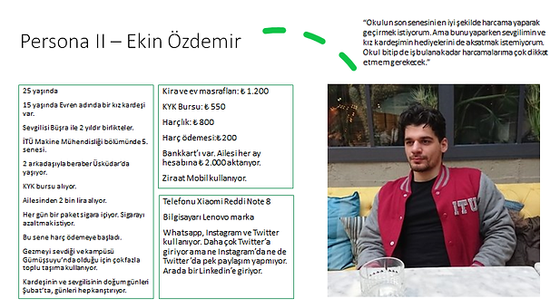
To be able to empathize better with our target groups, we created three different personas and primarily focused on their financial situations such as expenses, financial goals, incomes, etc.


User Journey
We formed user journey maps to define user pain points, possible problems and to inspire us to find solutions that met with the users’ needs.

Features
After empathizing with the users and theorizing on what we could do to help users facilititate keeping track of their financial situation, we carefully come up with various ideas. Laying them all in front of us, we evaluated all those ideas and the solutions they propose. With the help of our mentors, we chose the features that we thought the most helpful and fitting with the nature of our app.
A table of expenses divided into categories and a total sum of cash users possess on multiple platform
A saving feature that enables users to compete with their friends by placing bets or racing to save a defined amount for an activity.
A missions feature that rewards users that uses the app's key features and services frequently and are victorious in challenges monthly.
Other classical mobile banking features such as withdrawal, transfer, ATM finder, bill payment, exchange etc.
Saving feature that enables users save money for special occasions that they define automatically and periodically.
A feature that simulates as if the users spends an amount they defined to view how their financial situation is affected in the upcoming weeks or months.
A tagging feature that enables users to tag their expenses such as "market", "education", etc. so that they could evaluate how much they spend on them.
Sitemap
Click here to view the Sitemap
After establishing which features and functions should be included and how to solve user problems, we moved on to information architecture. We searched for best ways to present the information and features in our app.
Since the app offers multiple features and consist of data from various cards, expenses, and transactions, we focused on creating a simplistic, intuitive yet efficient order for the homepage which is the gateway to everything that is in the app.
We decided to use bottom navigation to eliminate the overcrowded order of a slide menu with subpages and to help users directly achieve to the functions they search the most with 1 tap.
We also added an editable “frequently used feature” so that users can modify a part of the homepage flow according to their needs.

Personas
Moving Onto Designs
Wireframes
We started off by quickly designing low fidelity digital wireframes to quickly demonstrate the general setting and features in the app.

Low Fidelity Prototype

Click here to view the low fidelity prototype.
After designing the necessary screens and creating a low fidelity prototype, we conducted a design critique session with our mentors to discuss our decisions and collect feedback on how the feature interactions should occur and what new pain points these design decisions cause.
After the design critique we decided to:
Add more color and dynamic to break the dull nature of finance tasks
Establish hierarchy and order with definite and intuitive indications such as bold type styles, lines, colors, scale, and proportion.
Presenting the name of each page at the top middle part of the screen since the app has various features and information.
Use gamification to engage with our target groups.
Mockups
Implementing the notes we took from our previous design critique sessions, we designed mockups that consist of warm colors, gamification features and strong hierarchy and order to present a satisfying experience.
During this phase, after each iteration and edit, we conducted multiple design critique sessions until we can find no more new pain points from the feedback we received.

High Fidelity Prototype
As we designed and iterated on our mockups, we also created a high-fidelity prototype to receive more accurate and real-life feedback.
The high-fidelity prototype followed a refined, more dynamic flow.

We added personalized guides on pages that engage with users to explain what these pages are for to simplify the user journey and to confirm their actions.
We tried to make the interaction resemble the relaxed interactions users make with their friends.


We presented some classical features with a more unusual approach such as adding this style to present the “Frequently Used Feature” page.
We added gamification features on “Competing With Friends” page where users could save money for an activity as a group and compete for the goal amount or place bets with each other.


We added obvious moving forward and moving backward interactions and page labels on top to help users navigate easily and not get lost.
We used a sincere, more like a daily talk narrative with bohemian visuals and emojis to present a more natural and fun experience for our target groups.
Takeaways
Impact
HesApp helps users who struggle managing their financial accounts by organizing the separated and scattered information and presenting them with simplicity in one place. Plus, the app brings a new approach to fintech apps by adding warm colors, a daily talk narrative, emojis, bohemian visuals etc. and breaks the common perception of “handling the financial stuff is boring.” Lastly, the app also enables users to socialize on a finance application by enabling them to compete when collectively saving money or betting.
What I Learned
This was my first ever UX design project. So, I learned about UX fundamentals, frameworks, tools, responsibilities, roles, and project development process from scratch.
I learned that feedback and research are the ingredients and UX designers have to come up with creative recipes with fixed ingredients.
Special Thanks
I am incredibly grateful to be selected and given the chance to participate in this program since it made me discover my passion for UX and made me decide on which career path I wanted to pursue.
I personally want to thank Sercan Er, Atılay Ünal, Kerem Rızvanoğlu and Özgürol Öztürk for being our mentors throughout the project. They were supportive, educative, talented, and super nice. I appreciate their effort and willingness to tutor us.